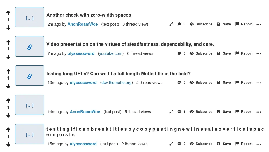
Otherwise, it looks like I'm lost in a sea of blinding white.
Also, there's also nothing to break up the monotony of whitespace, which isn't a good look.
Thanks!
And this is broken:
<a href="https://www.dev.themotte.org/16606894024598215.webp">https://www.dev.themotte.org/images/16606894024598215.webp
So people can't quickly share snippets of some bar chart or whatever.


Jump in the discussion.
No email address required.
Be the first to comment!
This comment section is a ghost town. Sign in